Designing a Matchmaking App to Find the Perfect Business Partner
- Aug 17, 2025
- 7 min read
Updated: Jul 13
In a fast-changing digital landscape, many small businesses in Spain still struggle to take their operations online due to limited time, knowledge, and resources. To support them, the Agentes del Cambio programme trains over 30,000 digital transformation specialists and offers grants of up to €20,000 to companies that want to bring these professionals on board. Even so, many graduates report difficulties landing their first projects: the current system does not effectively connect them with the businesses that need their services.
This project explores what a matchmaking app designed specifically to connect small businesses with digital transformation experts could look like. The goal is to make it much easier for both sides to find each other, understand one another, and start working together.

The Problem
Small business owners often operate with tight time and resources, and do not always know where to start when it comes to digitally transforming their companies. The current system, while simple, falls short in several key areas:
Overly basic profiles: On the platform, profiles only show an ID, the professional’s status in the programme (enrolled, graduated, eligible, or hired), their location, and a link to LinkedIn. With so little information, businesses struggle to assess whether a candidate truly fits their needs.
Limited communication: Companies can only contact experts through LinkedIn, with no messaging or notifications within the platform itself. This makes direct contact complicated and means many potential conversations never begin.
Lack of visibility for graduates: Professionals do not know which businesses have viewed their profile or who has shown interest. Without that information, it is difficult to follow up and tailor their message to each contact.
The Process
To address the problem with a user-centred perspective, we followed the Design Thinking phases: Empathise, Define, Ideate, Prototype, and Test. This structure guided us in turning an idea into a concrete, viable solution.
Empathise
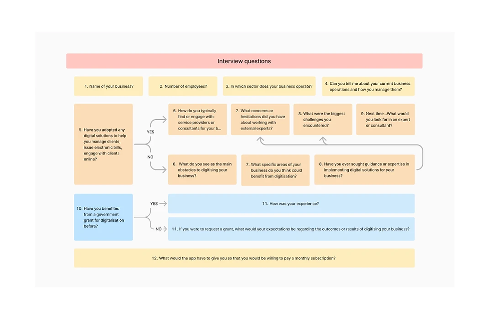
Our first step was to understand the experience of both user groups: small businesses and digital transformation professionals. We recruited participants through LinkedIn and prepared an interview guide to explore their experiences, frustrations, and needs when seeking or offering digital services. Where possible, we held conversations by phone; for those who preferred more flexibility, we also created an online survey.
During this phase, using AI tools like ChatGPT proved especially helpful. The AI helped us refine interview questions and synthesise the information we collected, making the research both deeper and more manageable.
Define
With the research results in front of us, the next step was to shape the problems and needs we had identified. We created an affinity diagram to group common themes and patterns, and built empathy maps that captured what users said, did, thought, and felt. This allowed us to visualise both their functional and emotional needs more clearly.
From there, we defined the key user needs and wrote clear point-of-view (POV) statements about what they needed and why. We also framed “How Might We” questions to guide the ideation phase, for example: “How might we enable better communication between businesses and experts?” and keep the focus on the real barriers we had uncovered.

Ideate
With the challenges clearly defined, it was time to explore possible solutions. We used methods such as braindump, a rapid idea dump, and the SCAMPER technique to look at the problem from different angles and move beyond habitual thinking.
To further expand the range of options, we used ChatGPT again as a creative partner. We worked with the AI to generate proposals that responded to two selected HMW questions:
How might we filter digital service providers and professionals to ensure they meet quality standards and client requirements?
How might we enable clients and digital service providers to find and communicate with each other effectively?

Prototype
Once we had grounded the idea, the next step was to turn it into something users could understand and comment on. For this, we created a storyboard of the entire experience, telling the story from the moment someone decides to download the app to what happens when they start using it.
The protagonist of the story is Marta, owner of a retail and wholesale sweets business who needs to digitise her company to reach more corporate clients. Following her husband’s recommendation, Marta downloads the app, completes the sign-up process, and finds an expert who analyses her business and designs a digital transformation plan that prepares her to grow.

Instead of creating the first wireframes directly in digital tools like Balsamiq, we decided to experiment with paper prototypes. This approach allows us to draw and modify screens quickly and focuses on testing the idea and the flow, rather than the visual finish. Because the sketches are clearly unfinished, users feel freer to comment and suggest changes. The process turned out to be much more enjoyable than expected, although it did require considerable effort to draw so many screens by hand.
We designed several screens that guided the user through onboarding, searching for professionals within the platform, viewing profiles, and the connection process between users. For each screen, we added explanatory notes detailing how each element should work and why.

Test
With the prototypes ready, we organised in-person testing sessions in a café, dedicating around 30 minutes to each participant. For these sessions, we refined the initial wireframes into more detailed paper prototypes that users could manipulate directly.
We gave each participant three concrete tasks and ran a small simulation of what happened when they pressed certain buttons. We asked them to explain out loud the steps they followed to complete each task, while we took notes on whether they could accomplish them, ease of use, functionality, and overall satisfaction. We organised the observations in a feedback matrix, with space for what they liked, criticisms, questions, and ideas. We also prepared a series of open questions to go deeper when needed.

Paper prototypes made the tests quick and very honest, thanks to the simplicity and low fidelity of the materials. Later, we moved to higher-fidelity digital prototypes in Figma, which sped up iteration and allowed us to show more clearly how the app would work.

Aesthetic and theme
We built the app’s visual identity around the idea of a hive, as an image of an active, collaborative community. The interface features Ivy, a friendly bee who accompanies users during onboarding and guides them through the first steps inside the platform. This character makes the experience feel warmer and more memorable.
After completing onboarding, users enter the “hive”, where they can interact with the “worker bees”, the graduates of the Agentes del Cambio programme. This concept reinforces the feeling of movement, teamwork, and community. We used Microsoft Designer to shape the app’s mascot, adjusting the description several times until we found the bee that fit Bizhive’s personality.
We integrated animations carefully to create a smooth, enjoyable experience. These small micro-interactions not only add visual character, but also help orient the user and make each step inside the app more intuitive.

The solution
Feedback from the tests was clear: users particularly valued that the app enabled two-way communication between businesses and graduates. This was one of the major gaps in the current system and became the core of the solution.
We developed a digital prototype in Figma that incorporated key features such as much more complete profiles, internal messaging, and notifications when someone visited a profile. Some of the most important improvements were:
Complete user profile: Bizhive profiles give businesses enough information to assess each candidate’s suitability. They include a photo, full name, company name, ratings, a short biography, and key skills. Badges act as visible proof of credentials and their position within the programme.
Direct communication: The app allows small businesses to search for and contact graduates, and also enables graduates to take the initiative and introduce themselves to businesses. This two-way dynamic fosters more lively and effective relationships.
Visit data: Graduates can see who has visited their profile and how they have interacted with it. With that information, they can follow up more carefully and tailor their messages more effectively.
Overall, the solution aims to bring small business owners closer to trained experts who can support them with personalised advice and digital services. At the same time, it offers graduates a clear channel to find opportunities and advance their professional careers.
Learnings
Design Thinking: Working through the Empathise, Define, Ideate, Prototype, and Test phases helps keep the focus on people and pushes us to go beyond the obvious solution. It is a structured way to turn an idea into a tangible solution.
User research: Combining phone interviews, online surveys, and in-person conversations allowed us to detect needs and problems from both the business and graduate sides. This immersion made their desires, blockers, and expectations more visible, and confirmed that two-way communication was a key differentiating value of the app.
AI as a design partner: ChatGPT became a constant ally, from improving research questions to synthesising results and generating ideas. Microsoft Designer also played an important role in creating the app’s mascot and bringing the visual identity to life.
Paper prototyping: Working with analog prototypes turned out to be surprisingly enjoyable, and users responded very well to a “draft” version of the app. Because it did not look like a finished product, they felt encouraged to share honest feedback. That said, drawing and modifying so many screens by hand is slower than iterating with digital wireframes, so for projects with tight deadlines it is more practical to work directly in digital tools.
Design variables: Incorporating variables within the design system helps make it more adaptable and easier to scale. Exploring different variants motivated us to look beyond the initial platform and think about other possible uses, allowing us to reorient the brand and the app’s aesthetic in the future.
Design system: We built the system from reusable basic elements such as the colour palette, typography, and main interface components, as well as buttons, forms, and grids. This base gave the product coherence and ensured a homogeneous experience. Instead of replicating highly complex systems from other projects, we let the system grow organically according to what the product needed.
Animations: Integrating animations contributed to making the design more attractive, increasing user engagement, and improving the overall experience.
Conclusion
The project demonstrates that, when designing digital solutions, it is equally important to care for the needs of businesses and the experts who provide the service. The matchmaking app proposes a more human and effective way to connect small businesses with digital transformation specialists, putting the focus on communication and collaboration.
Choosing the hive as the visual thread and featuring Ivy as a guiding character makes the experience coherent, recognisable, and enjoyable to use. The learnings gathered here will be especially useful in projects with many interactions and systems that need to grow over time, and show the potential of thoughtful design to reduce friction and create more meaningful connections in the field of digital transformation.


Comments