Pictime Studio: Launching an Architecture Studio Online
Updated: Jul 13
A strong website is more than a matter of aesthetics: it is a tool that helps a business launch with confidence from day one. For this project, Pictime Studio did not simply want “to have a website”. They were building their architectural visualisation studio from the ground up and needed a digital presence that would make them look professional and trustworthy from the very first visit.
“Sonia created an attractive and functional interface, effectively translating ideas for the tech team. Her commitment to deadlines, quality work, attention to detail, and collaborative approach were key to ensuring a smooth and successful development. I'll certainly work with her again.” – Leyre Hurtado, Founder at Pictime Studio
What Made this Project Special
This project stood out because the website and the business were born at the same time. In a competitive field like architectural visualisation, first impressions carry real weight: a potential client decides within seconds whether a studio can handle their project.
That is why we designed every detail of the experience, from the gallery to the contact form, to communicate rigour, clarity, and trust, not just showcase beautiful images.
What We Built Together
The Structure of the Website
We designed the site as a complete showcase for the studio:
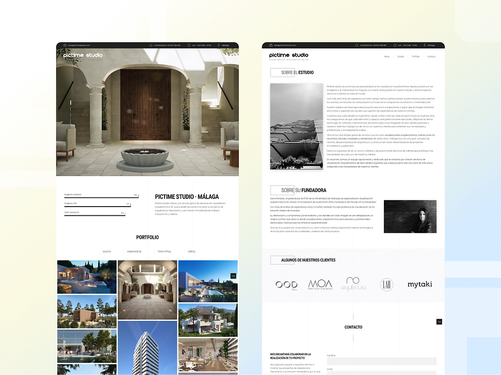
Home: a clean welcome page where visitors immediately understand what Pictime Studio does and the kind of projects they take on
Gallery: the space where the visualisations live, designed to display complex images without visual noise around them
3D animation and virtual tours: dedicated sections to highlight movement and walkthroughs, essential for this type of service
About the studio: a place to tell the studio’s story and give voice to the founder
Contact: a clear entry point to start conversations with potential clients
Design Approach
We kept the visual language deliberately restrained: a clean design, discreet typography, and generous space around the images. The website does not compete with the projects; it frames them. This sense of containment allows the visualisations to breathe and keeps the focus on the quality of the work, rather than on effects or decorative elements.
For the gallery, we chose a masonry layout, which organises images in different formats without losing visual rhythm. The result is a dynamic grid that makes the most of the available space and maintains a feeling of order, even when projects vary greatly in size and proportion.
Technical Foundations
WordPress: The Foundation
We built the technical base of the project on WordPress, a platform that provides a solid structure and flexibility for the future. The site allows the studio to add new projects, update text, and maintain their portfolio without needing constant technical support.
We worked with responsive design from the start, knowing that a large share of visits would come from mobile and tablet. We treated image optimisation, load speed, and security best practices as part of the design, not as an afterthought. This ensures a consistent and reliable experience across every device.
Planning and Strategy
Before writing a single line of code, we anchored the project in strategy. Just as architects work with plans before raising a building, we defined what the website needed to achieve so the studio could establish a strong presence from day one.
Clear Objectives
We clarified what the website needed to achieve beyond simply “being online”: attract clients looking for visualisation services, present the quality of the work with professionalism, make contact easy, and build credibility for a newly created studio. We designed each section, from the gallery to the contact page, with these objectives in mind.
Market Research
We analysed established architectural visualisation studios to understand how they presented themselves, what they talked about, and what they left out. The aim was not to copy formats, but to identify good practices and gaps where Pictime Studio could position itself with its own voice.
Client Profiles
This analysis revealed several types of client with different needs: architecture firms, developers, construction companies, and independent professionals. Each approaches the studio with different questions:
“Can you handle complex, high-profile projects?”
“Will these images help us sell faster and more effectively?”
“Will this make my offer look more professional in front of my own clients?”
We designed the content architecture to answer these questions clearly and quickly: what they do, how they work, what kind of projects they have delivered, and how to start collaborating.
By designing the website to answer all these questions clearly and immediately, we ensured that every visitor would find the information most relevant to their specific needs and concerns.
With this foundation, the website becomes more than a beautiful portfolio: it turns into a tool aligned with the way the studio wants to work and grow.
The Design Process
Prototyping
Before the site existed, we worked on its structure and interface through prototypes. Just as architects draw plans before starting construction, we created detailed paper mockups and explored different content layouts, gallery rhythms, and visual hierarchies.

This phase allowed us to make decisions with care: what visitors see first, how projects are ordered, where we invite them to get in touch. By visualising the complete journey before building it, the founder could understand how the website would feel to a client and adjust details before moving into development.
Once we selected the layout, we transferred it to a digital environment with the confidence of working on a tested foundation, not an improvised experiment.
Training and Autonomy
An important part of the work involved preparing Leyre to manage her digital presence with autonomy.
We covered basic maintenance tasks, how to use social media as a natural extension of the portfolio, and how to read performance data from the website and its channels. Our intention was to ensure the studio not only had a well-designed website, but also the capacity to grow it as the business grew.
Beyond the Interface: Strategic Planning
This project went further than designing an interface and publishing it. Pictime Studio was just starting out, so we worked on the website as part of a broader system that would help the studio position itself and grow from the beginning.
We addressed several layers in parallel:
Market and client research: We analysed the competitive landscape to understand which studios were already visible, how they communicated their services, and where space remained for a new proposal. From there, we refined client profiles and their motivations: what an established firm expects, what a developer needs, what an independent professional looks for when approaching a visualisation studio. We designed the website and its channels to speak clearly to each of them.
Business objectives and metrics: This was not just about “having a presence”, but about knowing what that presence should contribute to the business. We worked with the founder on concrete, measurable objectives (visibility, qualified enquiries, closed projects) and translated them into SMART goals: specific, realistic, and time-bound. This allowed us to measure the website and social activity with clear criteria, not just impressions.
Content and social media as an extension of the studio: We created a content calendar focused on what delivers value in this type of service: process, behind-the-scenes, design decisions, and the studio’s point of view as a partner, not just an “image provider”. We treated social media as a natural extension of the portfolio: a place to show work in progress, explain the how and why, and build trust over time.
SEO and local presence: We structured the website so search engines like Google could understand it easily: clear architecture, relevant keywords, strong performance, and well-organised content. We also configured the Google Business profile, essential for studios working with clients in a specific area. This way, when someone searches for architectural visualisation in their location, Pictime Studio appears with images, contact information, and, over time, reviews.
Together, this strategic layer ensures the website is not just a final destination, but the centre of a system that connects market, content, and business: a foundation on which the studio can continue to build as it grows.
Results
This project shows how a well-considered digital presence can give a newly created studio the same sense of solidity as its more established competitors. It is not about knowing every technical detail, but about having clear goals, understanding who you want to reach, and working with someone who can turn that vision into something tangible.
At Pictime Studio, the website is not just a container for projects: it is a natural extension of the studio’s practice, a place where their work, their judgment, and their way of collaborating with clients feel aligned. In the end, this is what makes helping businesses launch their online presence so rewarding: taking a professional practice that already has substance and giving it a digital form that matches its quality.
What This Means for Your Business
Today, any business needs a solid digital presence, but that does not mean becoming a developer or understanding every technical detail. What matters is having clear goals for your website, knowing who you want to reach, and working with someone who can translate that vision into a tool that works in your favour, rather than simply “being there”.
The best websites are not only technically sound: they are designed to help the business grow, attract the right clients, and sustain those relationships over time. Projects like Pictime Studio remind us why this care is worth it: it is less about technology, and more about giving a professional practice the digital stage it deserves, so it can present itself with clarity and start building trust from the very first visit.


Comments